Life Expectancy is Misleading
Life Expectancy is the average age of death across a population. If we're measuring how many person-years a population supports across a fixed number of births, averaging the age of death gives us some insight. Decreasing the infant mortality rate has a huge effect on life expectancy, while increasing longevity has an important but smaller effect. However, for individuals, the life expectancy isn't useful in any direct way. Say we have a 1000 people, with a life expectancy of 100 years. One might expect everyone lives to 100 years, but this is wrong. If just 10 die in their first year, and 50 each die in their 20's and 30's on the highway, then the other 890 would live to 109 years old! For a living 40 year old in this population (I'll assume you're among the living), planning savings for a life expectancy of 100 would leave a full 9 years unfunded.
This isn't a novel idea, but here I'm hoping to provide some numbers to base your own analysis on. Having median age of death would be more useful to an individual, yet still insufficient for planning (depending on the quanitization, may still be biased shorter). Instead, we want the life expectancy given you've already reached a certain age. As an example, the life expectancy for males in the US is 77.43 years (as of 2022). Yet the estimated age of death for a 35 year old male (born in 1989) would be 81.7 years, per the SSA. If I live to 70, this goes up to 87.4 years! This is only using age and gender, perhaps with some inference based on cohort (maybe they're including trends within the older ages - called mortality improvement).
In the US, the CDC provides statistics through it's WONDER dataset and national mortality files. Along with data from other countries, this is compiled by mortality.org, the "Human Mortality Database (HMD)". Some cursory searches see like this is a reputable data aggregation, while accessing the raw WONDER data seems like a lot of work. They have a lot of documentation, and have done all of hard data processing for us. To see what your distribution of outcomes looks like, set your age here and the year of the projection:
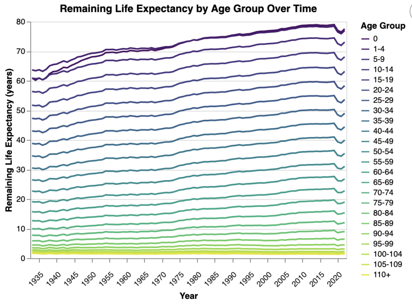
Life expectancy has been increasing, though we took a hit recently. The above projection does not factor in any extrapolation of trends that have been observered for mortality improvement. To get a sense for the trends on improvement, we can just plot them:

We can see that the improvements in infant mortality since the data started being collected show that life expectancy for newborns actually surpasses that for 1-4 year olds over time. Progress! The improvements for very late age are minimal.
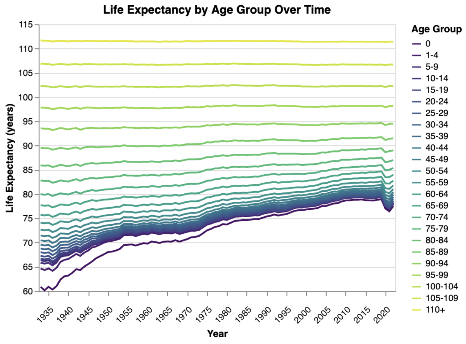
We can also look at this in terms of total life expectancy by age, though I see less patterns here:

To see the code developing the above chart and prototyping the interactive tool,
check out the Jupyter notebook here.
I made the notebook into HTML with jupyter nbconvert --to html usa-exploration.ipynb.