
Administered by:


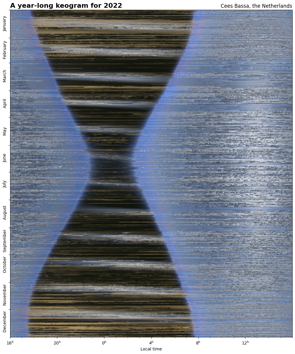
For the 4th year in a row, my all-sky camera has been taking an image of the sky above the Netherlands every 15 seconds. Combining these images reveal the length of the night changing throughout the year, the passage of clouds and the motion of the Moon and the Sun through the sky. #astrophotography
 and the Sun climbing higher in the sky during summer.")
The year-long keogram is constructed from daily keograms, where each daily keogram takes the central pixel column of the all-sky images of each successive image to show motion in the sky. This video shows the all-sky images for a 24h time span and the resulting keogram shown below.

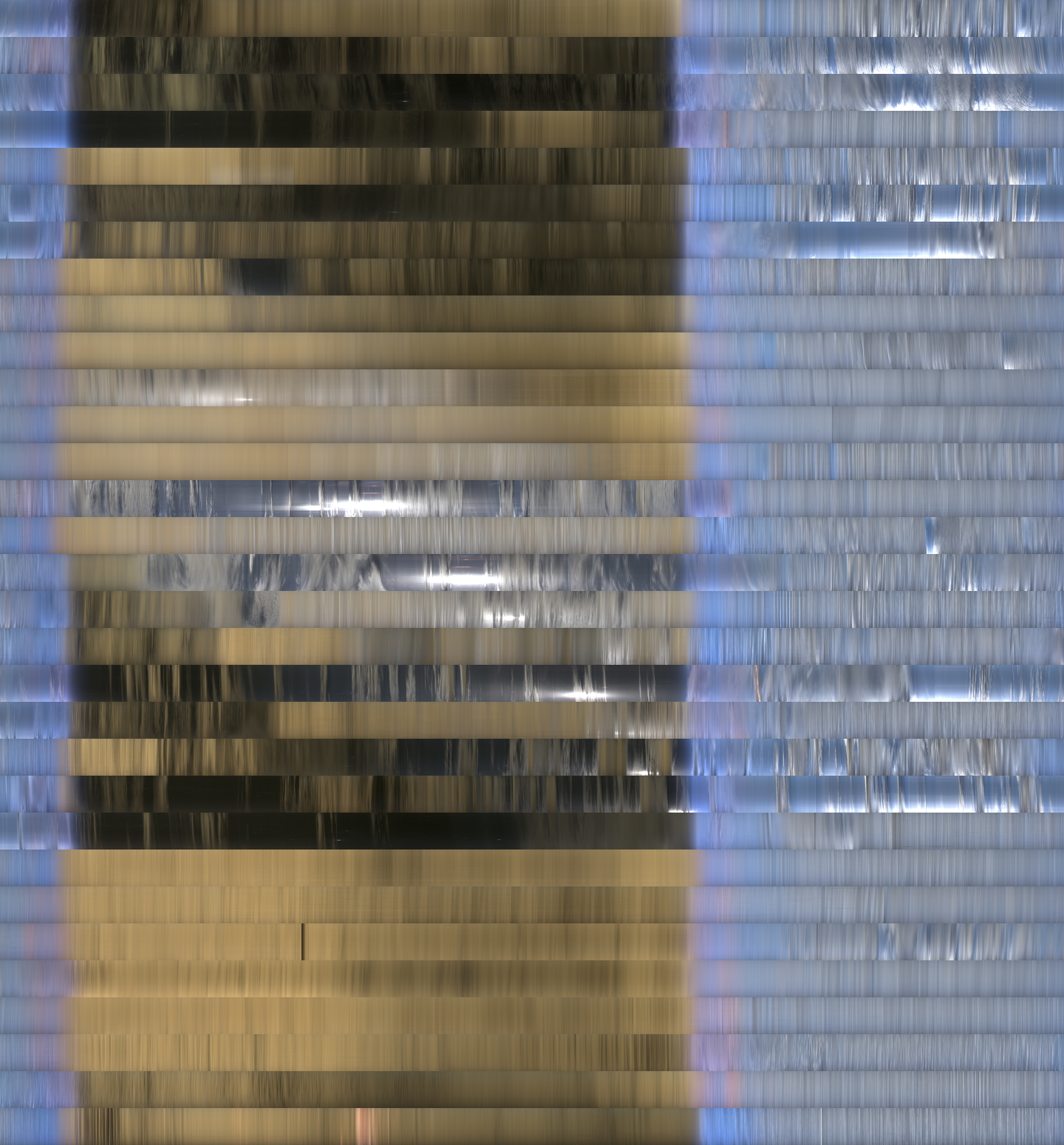
Zooming in on the daily keograms, the motion of celestial objects becomes clear. These daily keograms from January 16th to February 2nd 2024 show the Moon moving across the sky. It starts at sunset near first quarter, culminates around full moon, and ends at sunrise near last quarter.
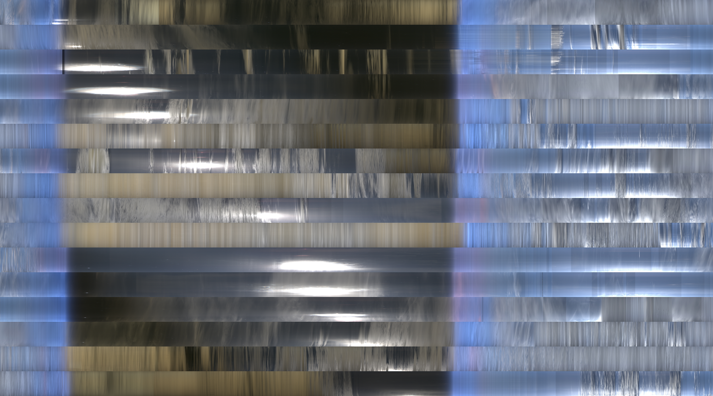
Similarly, the stars move across the sky. During June, when the nights on the Northern hemisphere are short and the sky does not fully darken, the bright star Vega is high in the sky. Over these 12 daily keograms, we see Vega moving slowly left by 4 minutes every day.
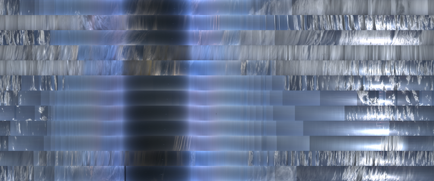
During 2024 there were two nights with Northern Lights that were relatively clear. The keograms of those nights captured the colors and motion of the Aurora Borealis. Keograms were specifically designed to study the Aurora: https://victoriaweather.ca/keogram.php.
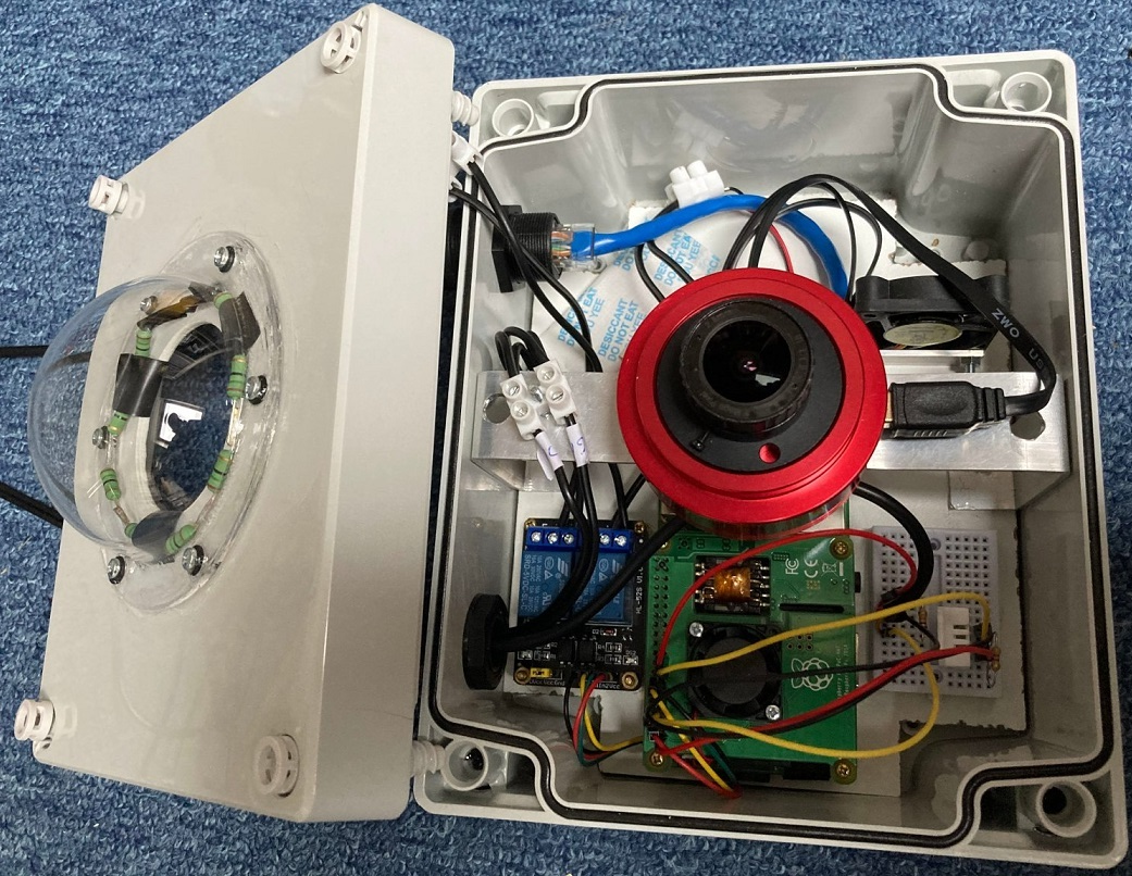
The all-sky camera consists of a ZWO ASI178MC color camera with a 2.5mm F/1.2 fish-eye lens. A small Raspberry Pi computer operates the camera and sets the exposure time and camera gain based on the sky brightness. It also controls a dew heater and a fan to prevent condensation on the acrylic dome.
I am amazed that this setup has been running smoothly for over 4 years now with almost no problems. The 24/7 operation is required to be able to make these year-long keograms, and I am happy that I can just leave the camera running for such a long time without things breaking (knock on wood).
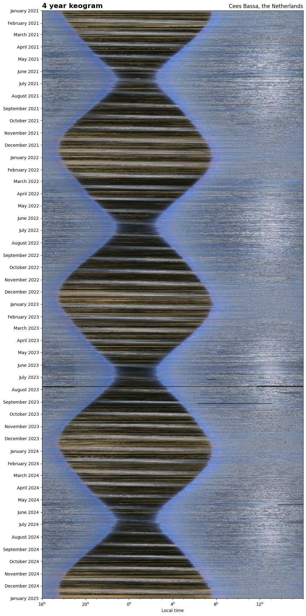
It is interesting to compare the shape of the 4 separate year-long keograms. The shape of the hourglass stays the same, but the diagonal bands of the Moon moving over the sky change from year to year.
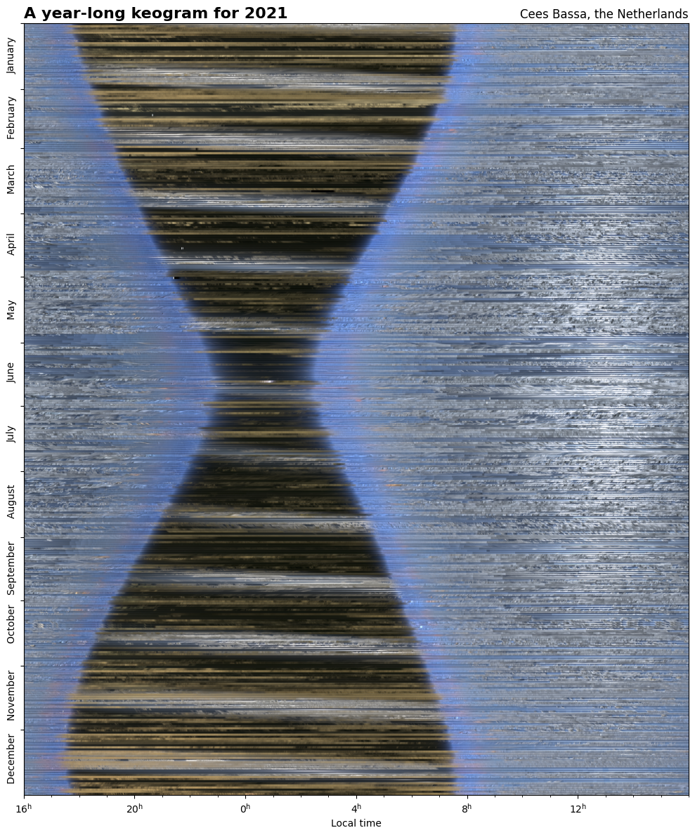
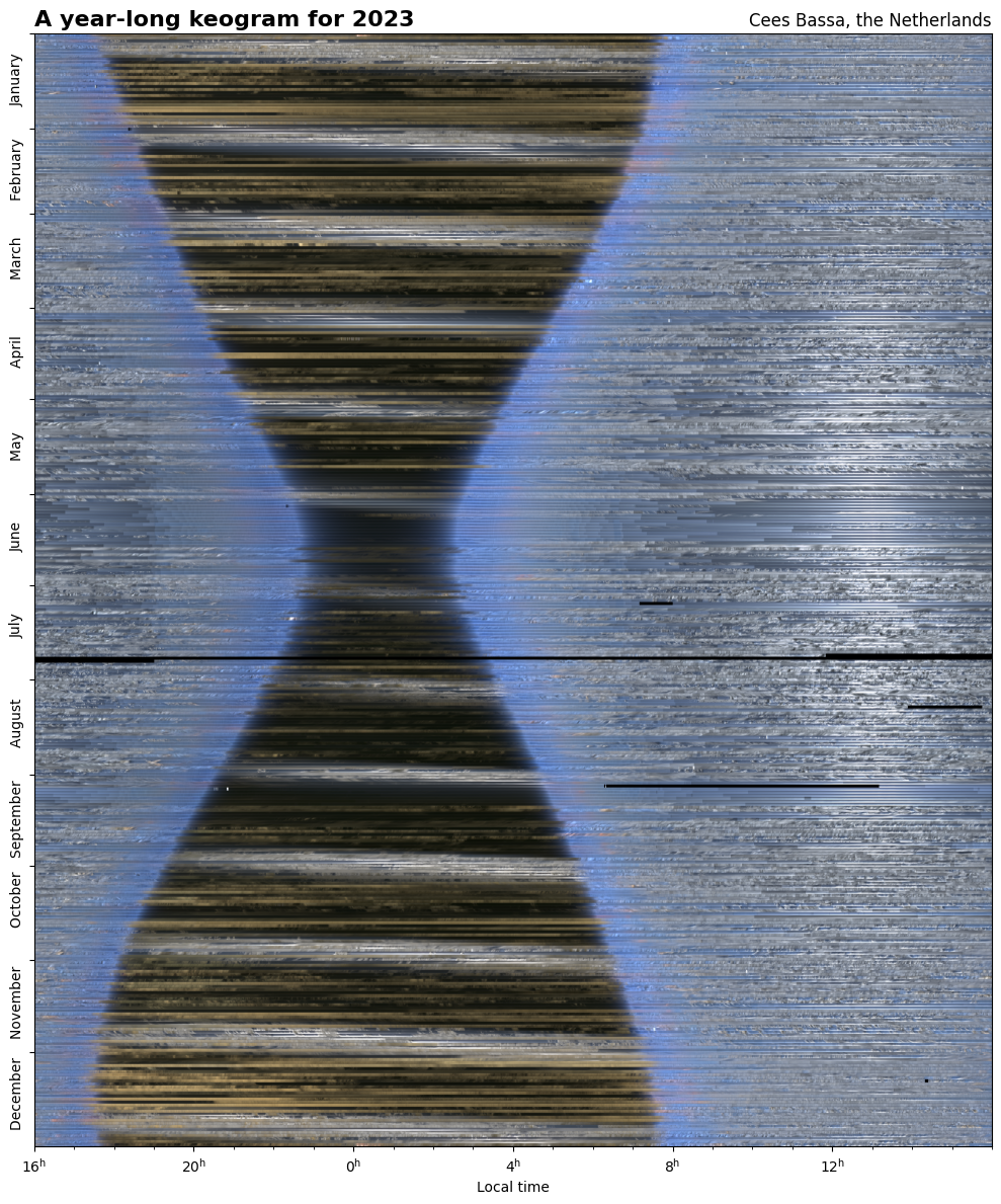
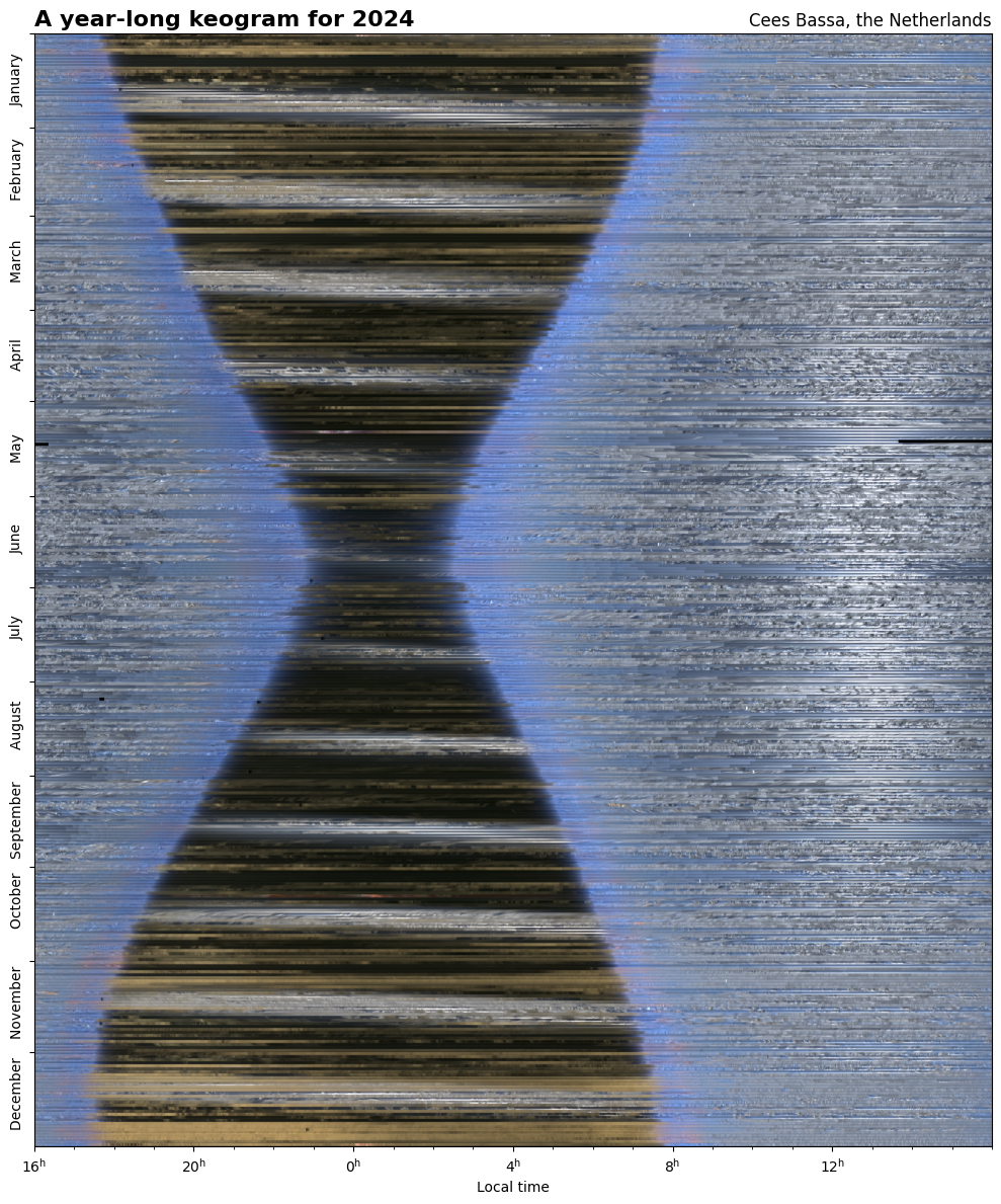
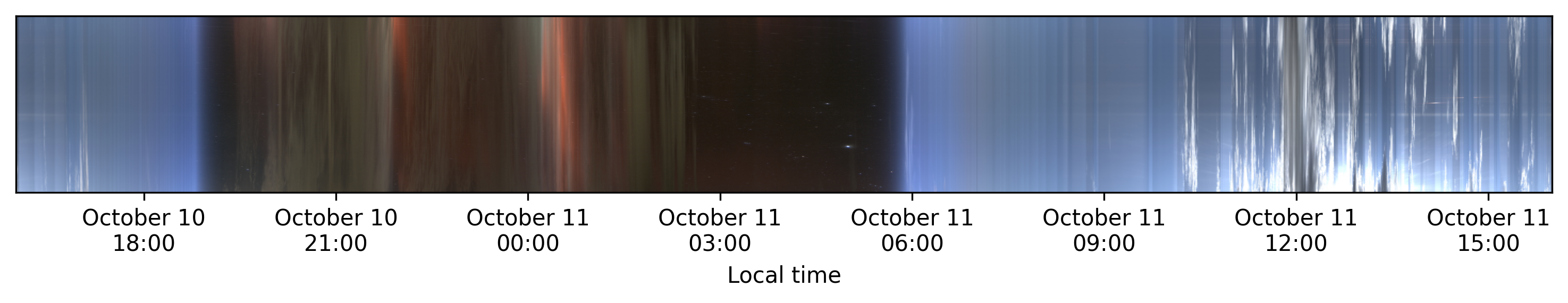
Combining the 8.4 million individual exposures (2TB of data) into a single keogram covering the 4 years from 2021 upto 2025 shows the repeated change in length of the night, and also highlights the small differences in sunset and sunrise times due to the eccentric orbit of the Earth around the Sun.
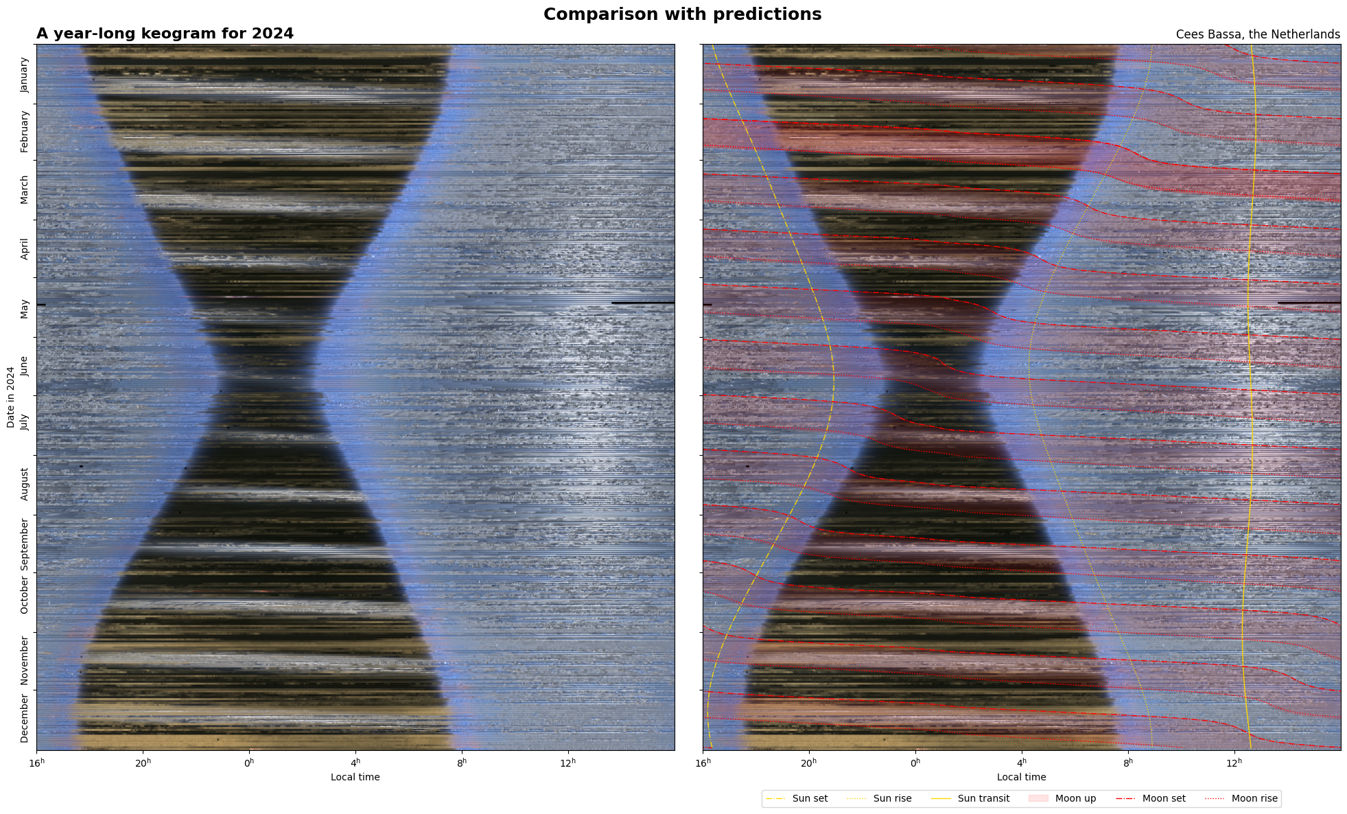
To clarify what is exactly happening, this figure compares the keogram with predictions for rise and set times of the Sun and the Moon.


Do you have any products you are selling made out of these pictures? Eg a calendar (a monthly flip, or a daily tear-off), or notepad or.... anything?
@ike No I don't have that.

@cgbassa Very cool, thanks for sharing! - Initially I thought it was a cross section through a piece of metal. 


@cgbassa is there any increase or decrease in cloud cover?
@MummaBear I have not checked that, but it certainly is something that could be determined from the images.

@cgbassa incredible. Im taking a beginners course (summer school) and am just starting to get my head around celestial objects. This visualisation helps, thank you


@cgbassa there you also see why it's called blue hour 
so so so cool, this whole thing!

@cgbassa i have no idea what a keogram is but i know it's fucking beautiful!

@cgbassa very nice! Do you mind if I ask what software you use? I have a ZWI that's been failing continuously with AllSkeye and it's default software this last year (overheating the computer, freezing up)...


Does anyone plot a Keogram based on sidereal time? That would freeze the motion of the stars, yes?
@KrajciTom That would indeed fix the stars and add a slope to the whole plot. Basically from top to bottom each daily keogram would shift along a diagonal line from top left to bottom right.


@cgbassa Weird how the sun shrinks and disappears near the middle...


@cgbassa looks a bit like the dress https://en.m.wikipedia.org/wiki/The_dress

@flo You are not the first to see the resemblance 

The moon! 
(Can you explain the asymmetry at the bottom of the image? Why is the time of sunset so constant in December?)

@CelloMomOnCars @cgbassa my understanding is that it's mostly about the change in solar noon (from the varying speed of the earth along its orbit around the sun) partly compensating the change in day length. https://www.timeanddate.com/astronomy/equation-of-time.html has a more technical explanation

@LeoRJorge @CelloMomOnCars Leo is correct here. The asymmetry is due to the slight eccentricity of the Earth's orbit resulting in the Sun passing the Southern meridian early or late depending on the time of year. It is more obvious with predictions for Sun rise, Sun set and Sun transit times overlaid on the keogram.
Thank you for adding the overlay, it's really clear now.
(Remind me to help protect science as well as the planet)
Wow that's fascinating!
Thanks for the link.
(Remind me to help protect this planet, it's a cool planet).

That's the meaning of solstice.
@cgbassa have you written about the process of how you made this? It's *exactly* what was in my head when I built my skycam but the processing power to compile the 300k+ pictures was a pain
@coldclimate @cgbassa was wondering the same, it's such a cool data visualisation exercise!
@coldclimate Not in detail as many others before me have written about designing/building all-sky cameras and the software needed to capture individual images and create keograms, see https://github.com/AllskyTeam/allsky/. I've only taken their work a small step further. My main changes have been to the capture software to change the exposure logic to also be able to capture during daytime. All individual exposures are offloaded to storage on another computer. On that I create the daily keograms, which are then combined into these year-long keograms, all with custom python code.

@cgbassa thank you. I might have a go to revisit this again this year. My code was a lot of bash and ffmpeg
@coldclimate That should also work. Python is a bit easier as the 15 second exposures aren't exactly spaced at 15 second intervals. So I first make a daily keogram from all images of that day, and then interpolate that to integer minutes to give me 1440 columns per keogram (one per minute for 24h).

@cgbassa This is truly amazing. Also kudos for maintaining a working camera for that long!
@f4grx Really the only thing to maintain is to make sure the small SD card doesn't fill up. So in the morning I pull over the data from the previous day to a local PC.

@cgbassa, I don't see cuts for the daylight saving time adjustments.
@tero That's correct. The local time is essentially kept at CET throughout the year for this plot.
@cgbassa Is the yellow at night light pollution, and are street lights dimmed fromidnight to 06:00 in December? Or is that something else?
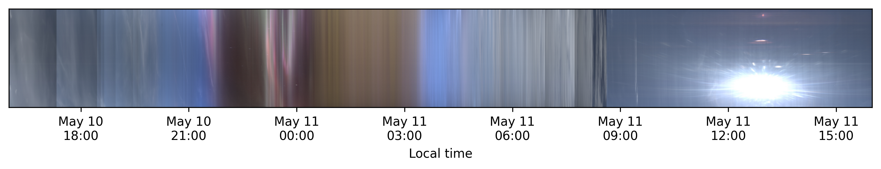
@chrysn The yellow is due to low-altitude cloud cover and fog, which, with this camera, comes out as yellowish, probably due to illumination from streetlights. There is no dimming of street lights, more that clouds change color to gray/white in daytime. Here's a plot of all of December 2024.
@cgbassa Nice, it shows New Year's Eve's fireworks even. Still looks like a dark rectangle up and to the right from there, but it's hard to tell whether clouds become less there or human light decreases (car headlights, maybe?)
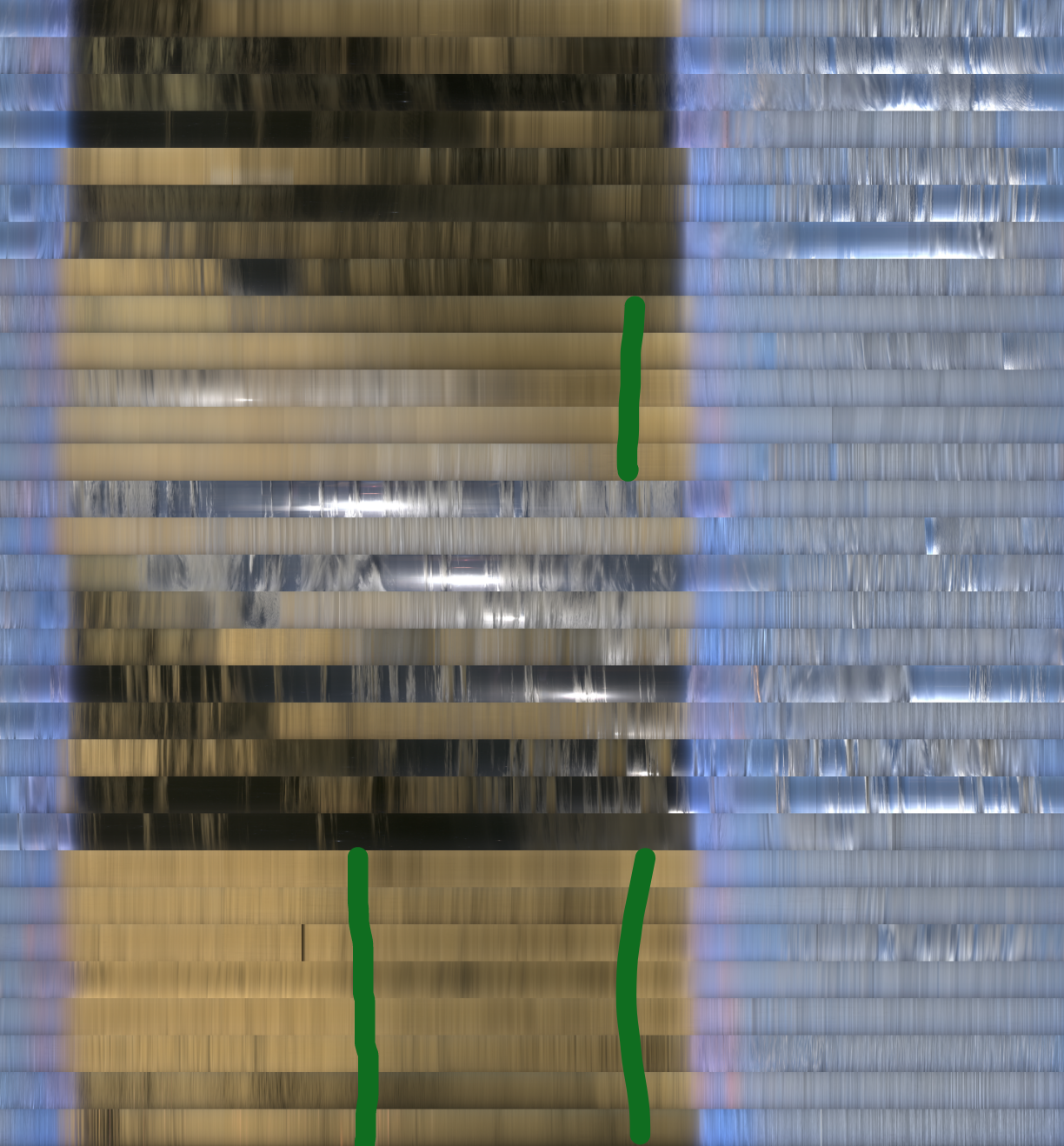
@chrysn Can you draw on that plot with December which rectangle you mean? There might be some garden lamp on a timer somewhere in the neighborhood that I haven't noticed before.


@cgbassa huh, is dusk and dawn really switching do fast? Or is that a automatic gain control thing?
Not like I ever experienced it myself xDD
@Birk_lab That indeed is the automatic gain setting and color response of the camera.


@cgbassa that is very cool!

joke tangent
joke tangent
@cgbassa What are the downsloping light diagonals in the night? They look periodic with the month-axis.
I make one of these per day for the view from my north facing camera.
@edwiebe Those are the days and times of day when the Moon is up during the night. Compare the keogram with this figure where predictions for the Sun and the Moon are overlaid.

@cgbassa The Moon! Of course!

@cgbassa very nice. Thanks for sharing!

@cgbassa these are absolutely brilliant, thank you for sharing!
@cgbassa why do the red areas/curves have such a kink in them?