The big happy hedonometer science
This month the latest, big happy, research paper from our group the Computational Storylab was published (journal link). In the press, this paper has been very strong, with lots of coverage that includes the New York Times, CBS, CNN, and Science magazine. We've collated some of the most popular articles, and I've put them on the hedonometer press page.
All this coverage has meant lots of extra work for some people involved with paper, myself included. The interviews of my advisors Peter Dodds and Chris Danforth have shown up in each of the press pieces, which has left me to scramble together a couple visualizations.
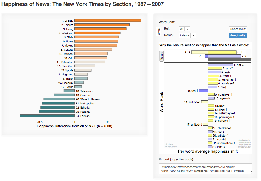
In particular, the week before the article appeared in the NYT, I've been working hard to update the city and state rankings with the final 2014 numbers, and doing a one-off anaylsis of the NYT by section. With word vectors in hand from Jake Williams who parsed the NYT data with perl magic, I put together a showcase that ranks and compares the individual sections of the times.
Here's an image that links to full visualization:

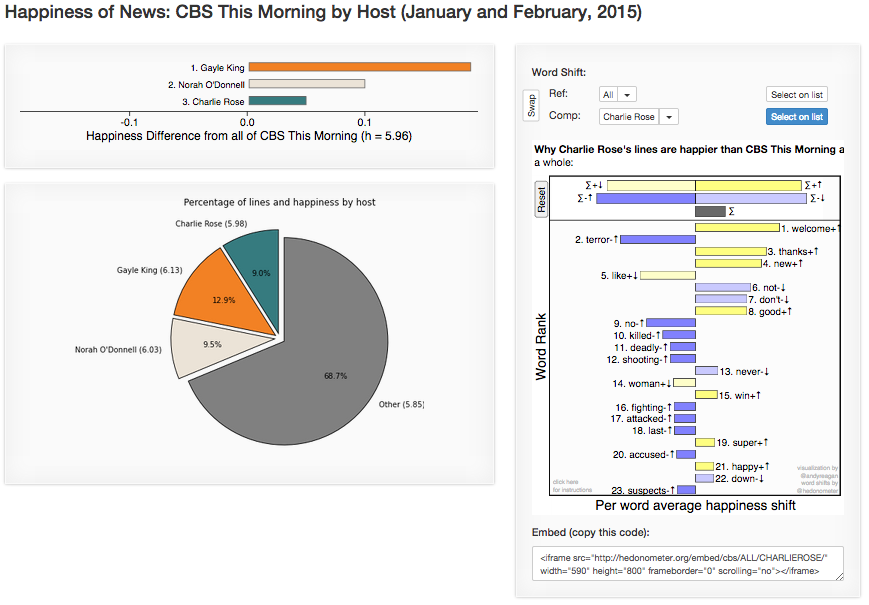
Most recently, we learned this past Monday that John Tierney of the NYT was going to be interviewed on CBS This Morning and I spent most of the day putting together a comparsion of the anchors. They sent us the complete transcript of their show since the beginning of 2015, and I put all of the tools that I've built to use in making a speedy viz. This is online here, with the video of Tierney being intervied at the bottom:
